UNIT 35
Role
Creative Direction
Deliverables
Creative direction
Visual identity
Social media assets
Agency
Freelance
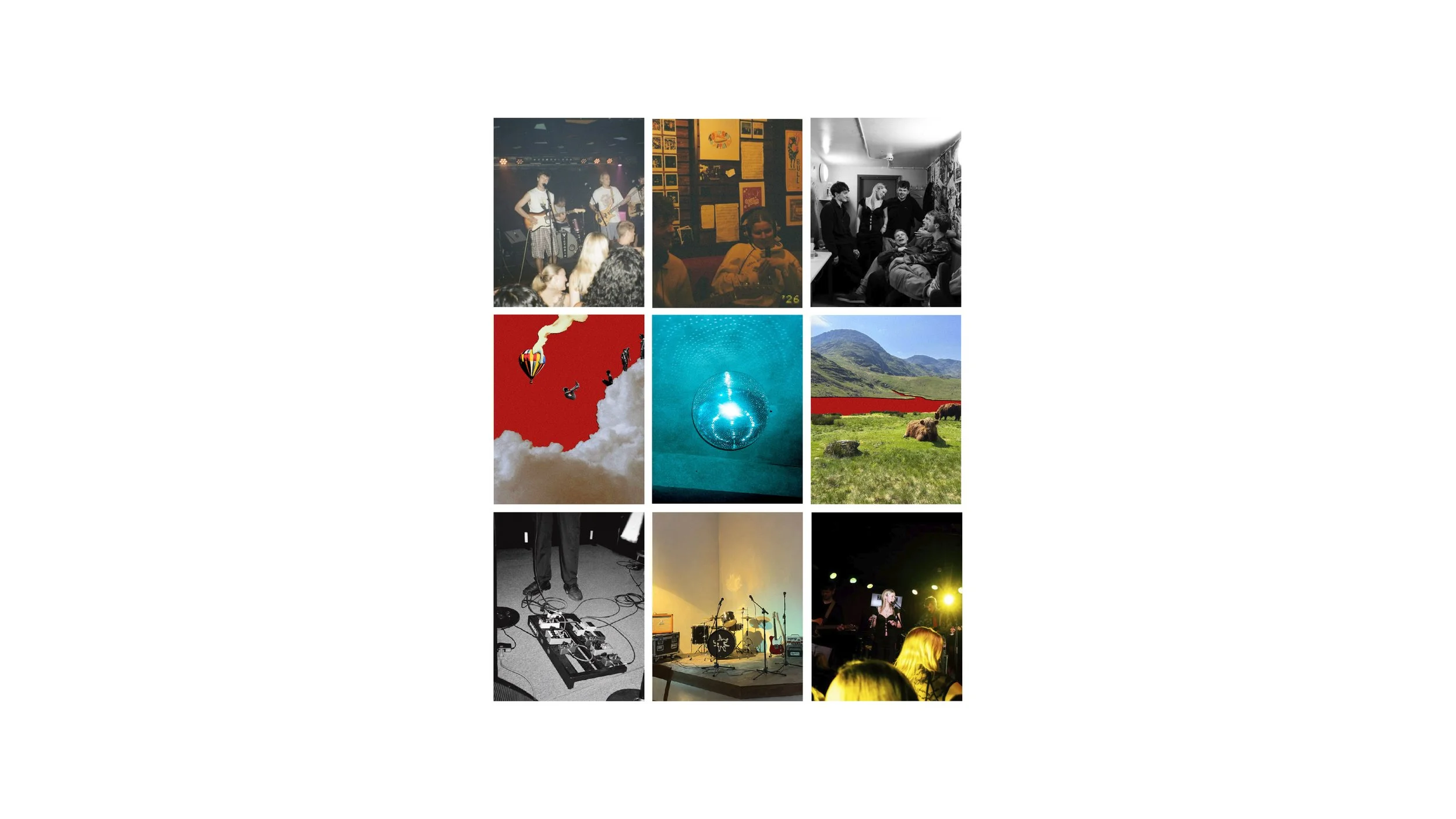
Unit 35 is a six-piece pop-rock band built on friendship, collaboration and a shared creative spirit.
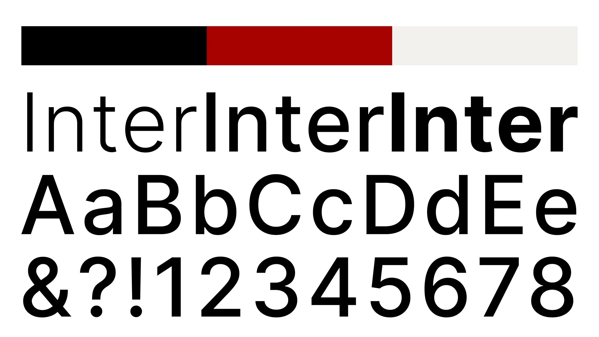
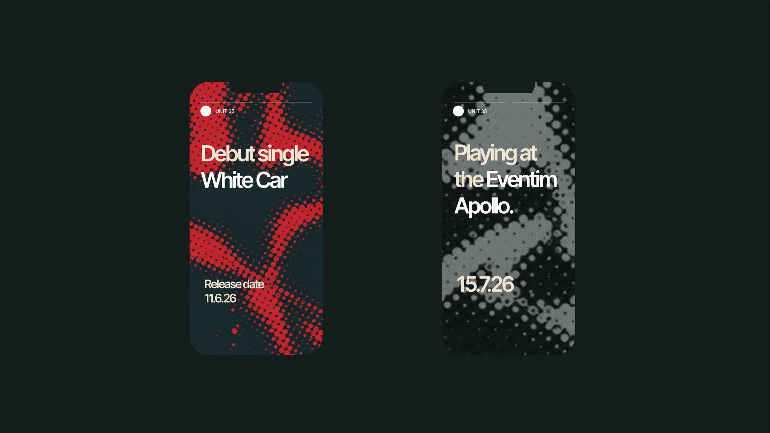
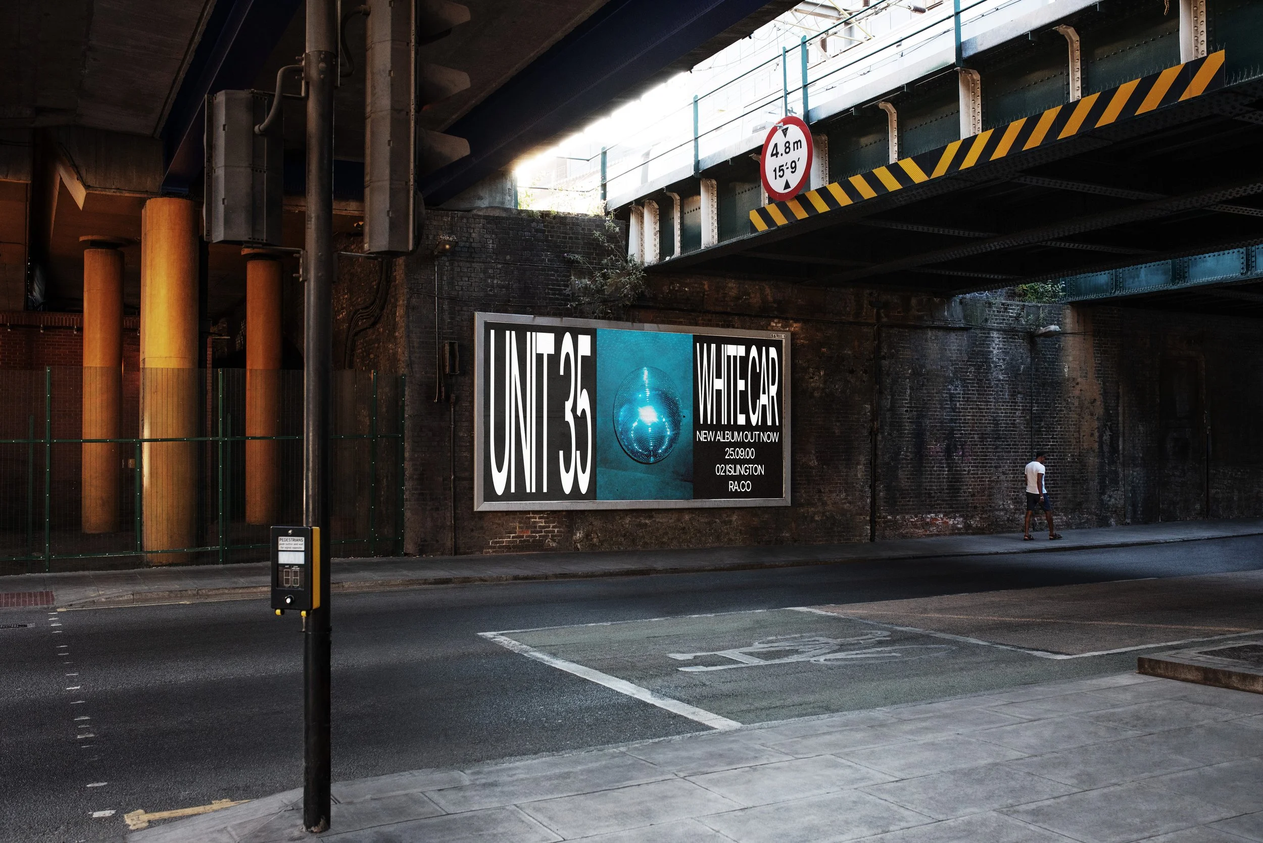
The challenge was to create a cohesive identity system comprising a logo, icon, colour palette, typography and custom pattern, designed for use across digital, social and promotional touch points.
Research began with interviews and discussions to better understand the band's personality, values and ambitions. A key insight emerged from these conversations: Unit 35 viewed themselves not as individual performers, but as a collective, with each member contributing to a larger whole.
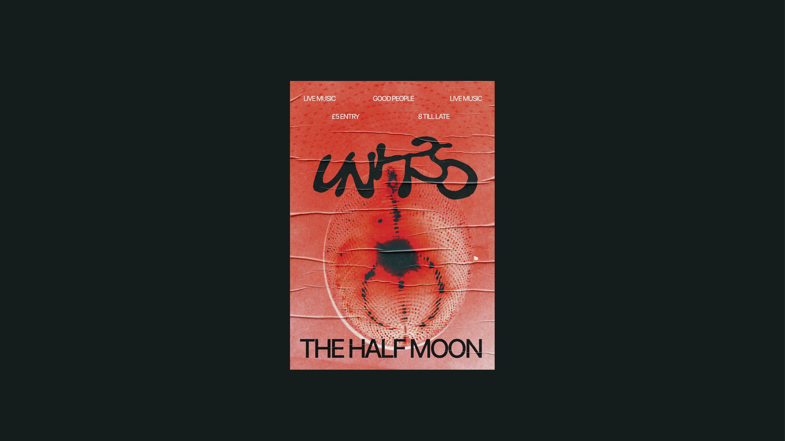
The logo was designed to embody the idea of connection. To explore this concept, a series of experimental mark-making techniques were tested using a range of liquid mediums to create fluid, interconnected letterforms.
Ketchup proved to be the most successful medium. These forms were then refined digitally, with each letter carefully joined to create a distinctive logo.