Magdalen park
LAWN TENNIS CLUB
Role
Creative Direction
Deliverables
Visual Identity
Social Media Visuals
Agency
Heavenly Group
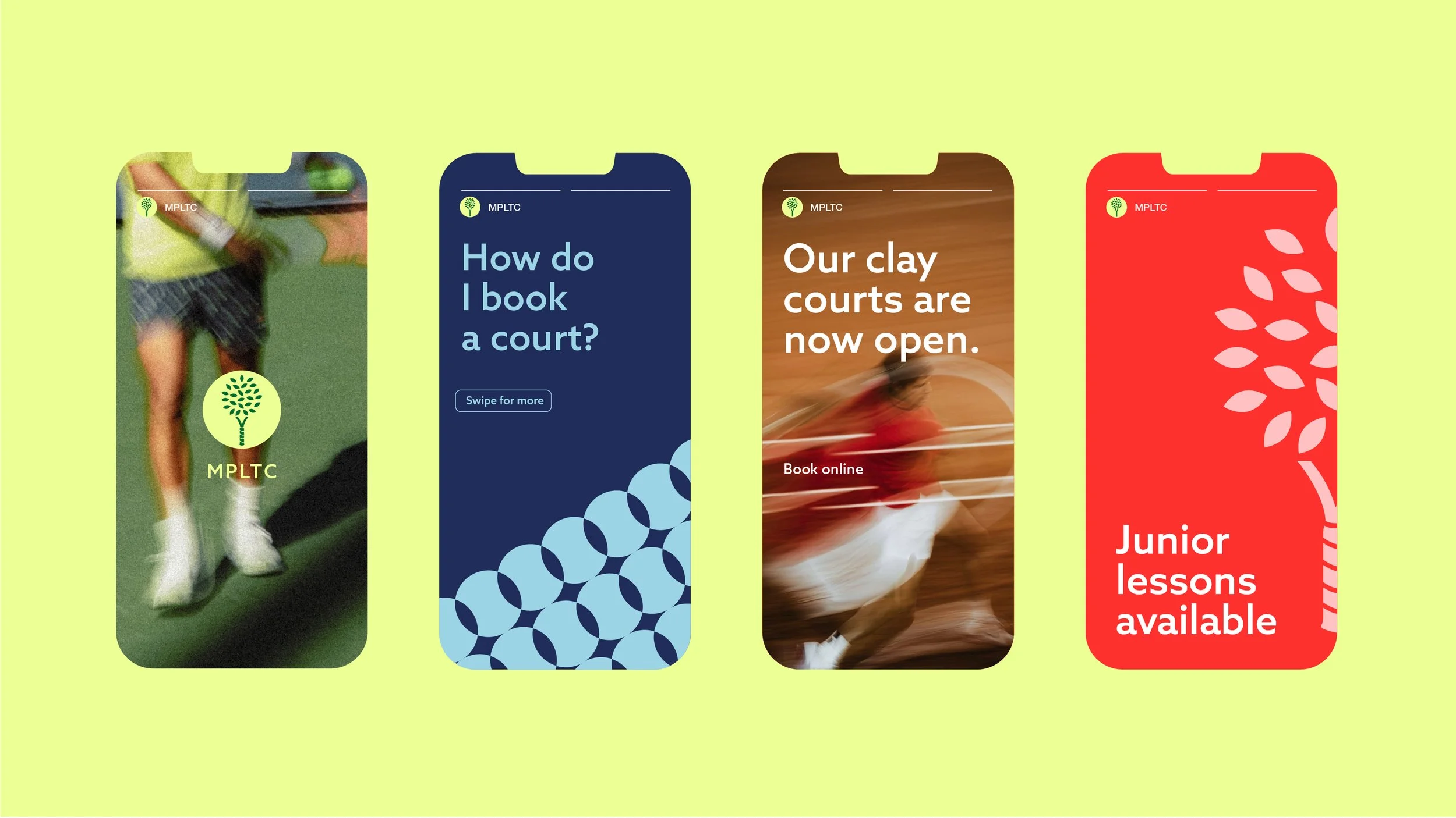
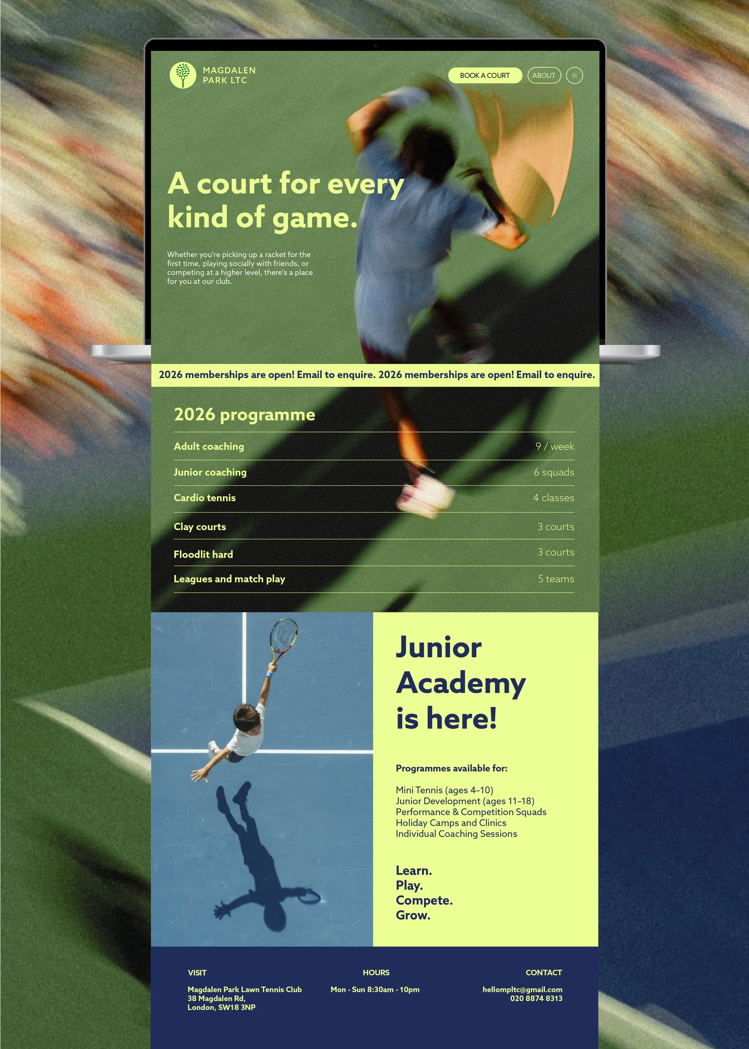
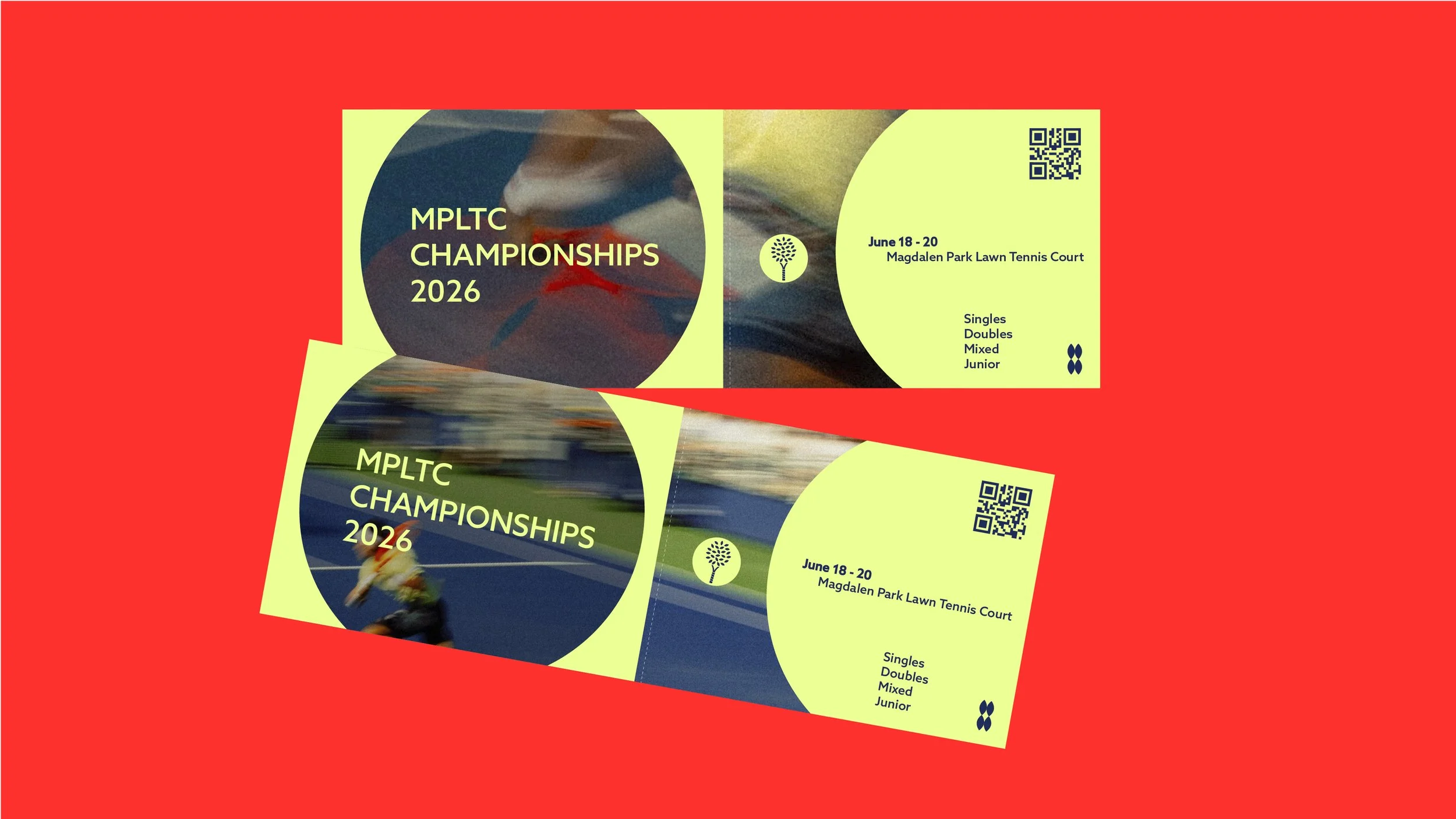
Magdalen Park Lawn Tennis Club required a refreshed visual identity to replace its outdated logo system and establish a more cohesive brand presence. The brief was to create a modern identity that retained a sense of heritage, and a colour palette rooted in tennis, helping to create a recognisable visual language across digital and physical touch points.
Research began with a visit to the club, providing insight into its character, environment and community. One of the strongest observations was the importance of the club's gardens and surrounding greenery, which members viewed as a distinctive part of the club's identity. This led to the concept of celebrating the "Park" within Magdalen Park.
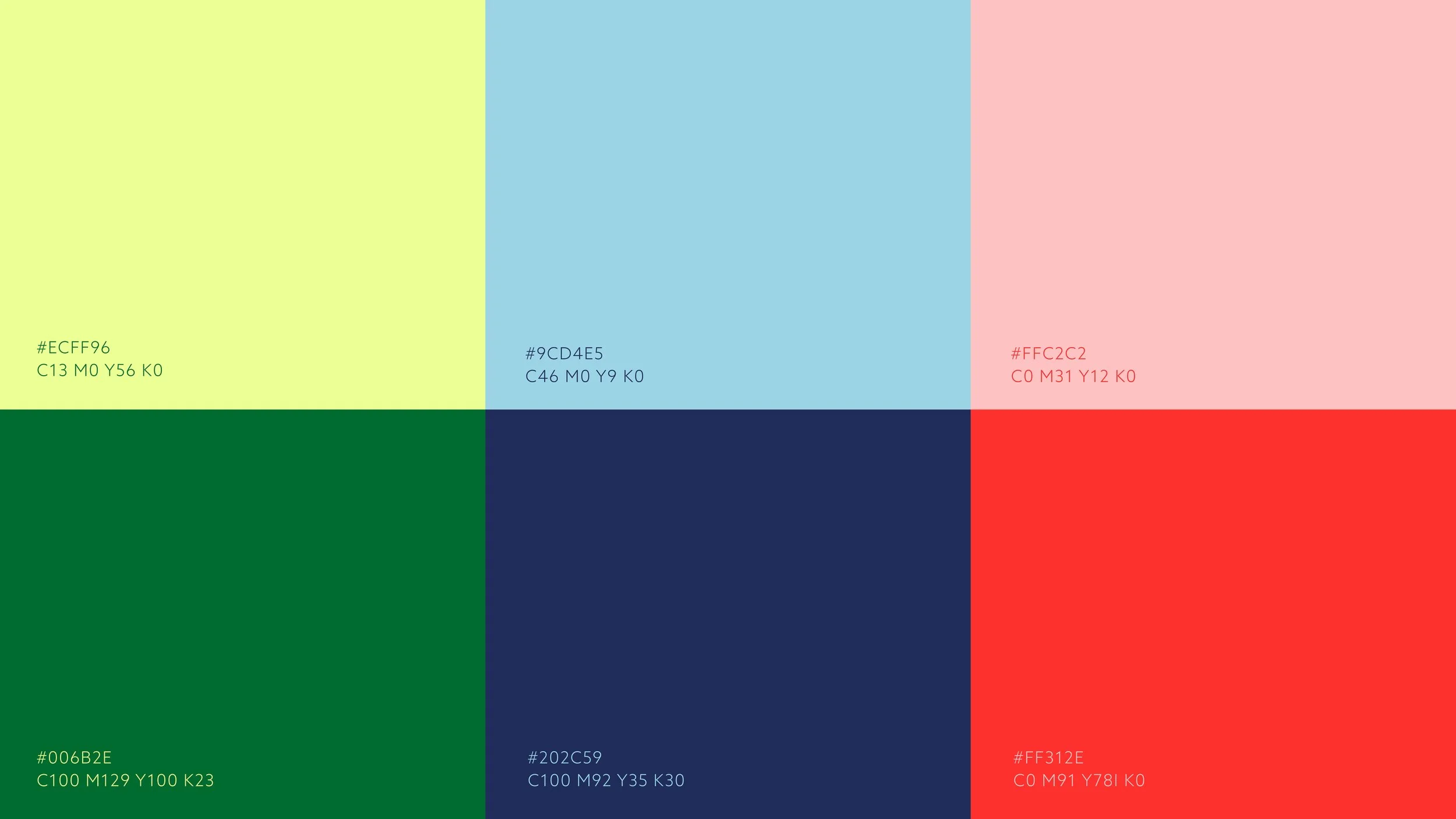
These colours are rooted in tennis, taking cues from the court and the energy of the game. The brighter tones give the palette a fresh, contemporary feel while keeping a clear connection to the sport.
Once the icon had been refined digitally, it became the building block for the wider logo suite. The primary logo adopts a traditional tennis club badge formation, balancing heritage with a more contemporary aesthetic, while additional lockups and formats were developed to ensure flexibility across merchandise, signage, social media, website applications and club communications.
The logo development process began with the creation of a central icon that could form the foundation of the wider identity system. The concept focused on combining the club's two defining characteristics: tennis and its parkland setting. Through a series of sketches, a symbol emerged that merged a tennis racket handle as the trunk of a tree.